Search Quirksmode
Search Quirksmode

I know, I know another Grid system, but bear with me, this one is pretty cool and we have been using it on all our large scale projects at Beyond for the last few years and thought it was time to share.
Currently this only works with Sass, but a PostCSS version is nearing completion, will share once it’s ready. Here’s an example of the code used to create a simple 12 column layout:
This defines the CSS to style the grid.
@include rg-create-grid(
    $grid-class: "grid-fullwidth",
    $width: 1280px,
    $gutter: 20px,
    $margin: 24px,
    $columns: 12,
    $breakpoint: "tablet"
);This creates the grid structure.
<div class="grid-fullwidth">
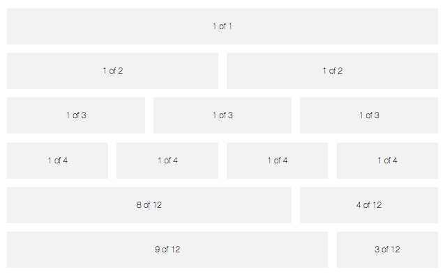
    <div class="col-1-1">1 of 1</div>
    <div class="col-1-2">1 of 2</div>
    <div class="col-1-2">1 of 2</div>
    <div class="col-1-3">1 of 3</div>
    <div class="col-1-3">1 of 3</div>
    <div class="col-1-3">1 of 3</div>
    <div class="col-1-4">1 of 4</div>
    <div class="col-1-4">1 of 4</div>
    <div class="col-1-4">1 of 4</div>
    <div class="col-1-4">1 of 4</div>
    <div class="col-8-12">8 of 12</div>
    <div class="col-4-12">4 of 12</div>
    <div class="col-9-12">9 of 12</div>
    <div class="col-3-12">3 of 12</div>
</div>
And this code will give you the following:

This is just a small taste of what it can do, there are loads more options and configuration settings to play around with, so be sure to check it out and click the link below.